 Home
Home 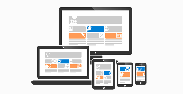
Mobile use on the rise
The communications industry regulator Ofcom released figures earlier this year which indicated that the use of mobiles and in particular, smartphones and tablets has increased significantly in just the last year.
More than 80% of people reported that they will go online in any location and across a range of devices. 62% of UK adults reported that they owned a smartphone which was 8% up from 2012 and the number of people using tablets has doubled from 16% in 2012 to 30% in 2013.
One third of these people are using their mobile for shopping – that is a huge number of potential customers.
You have paid good money to ensure that your website is seen by Google, that it is SEO friendly and that it is easy to use and well designed – if that hard work stops at the end of the keyboard and does not translate into mobile technology, it is a waste of your marketing budget – you are missing out on sales.
Responsive websites are now the standard
Responsive web design means that your website will respond accordingly and adjust to whatever device your visitors are using, an intermediate solution for this was to have a separate mobile site, sometimes a smaller version of your main site, but in 2014 responsive web design is well established and the new standard.
Ensuring that your website is responsive is a key element when it comes to translating your website design from the large screen of a desktop computer to the different devices.
These all have different sized screens and function in various ways. You need a web designer that can ensure your website will react perfectly – no matter where your customer is and what they are using to view it.
Responsive websites will adjust to the device with a minimum of scrolling or resizing and will also offer the full website experience. Your website will be designed to have adjustable images, flexible page sizes and will load quickly and easily regardless of the device.
Essentially your website will have the technology to respond to the way your customer uses it.
Responsive web design is crucial in 2014
Times have changed and are still changing, your website needs to have the ability to change as the habits of your customers do. With 4G already available throughout London and other places, the possibility of your customers making purchases day and night from anywhere in the world are now a reality, so you want to be the first supplier they think of.
Your website design will play an important role in how you are perceived in this technological world. You certainly don't want to be left behind.
Do you have any thoughts of your own on the state of the mobile web?
We would love to hear from you in the comments below, or on our social media, why not share this post. Thank you.


